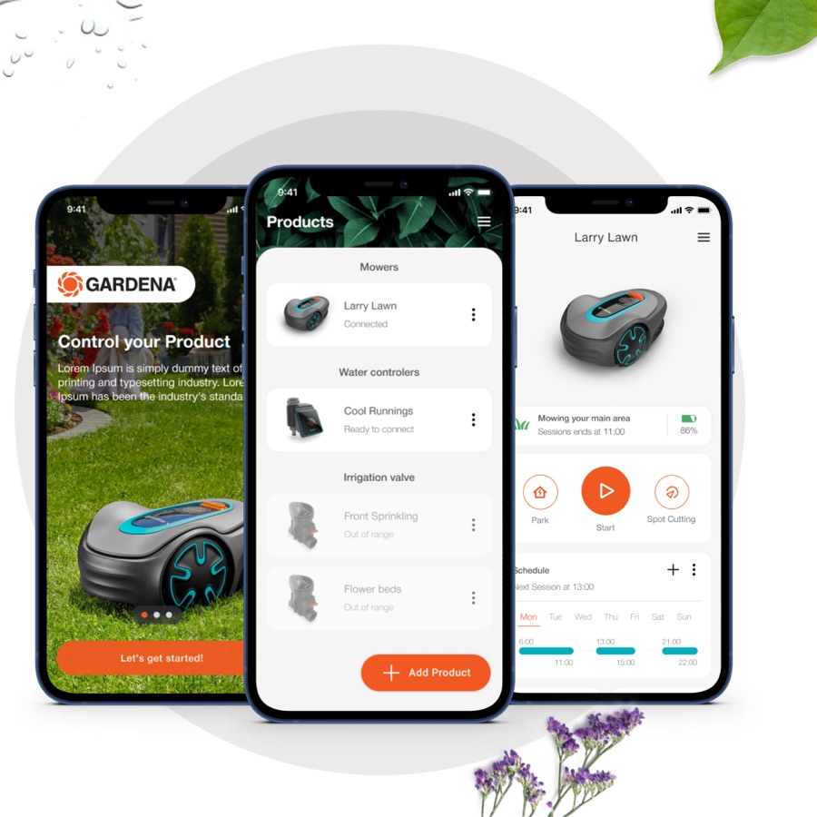
Garden tech you control from a deck chair
The brief
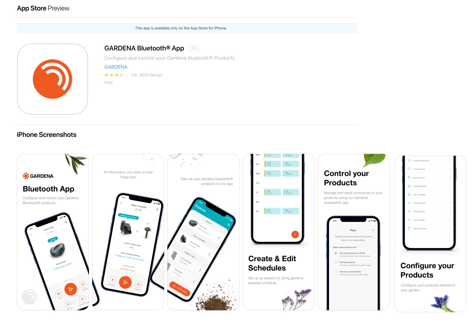
Gardena's Bluetooth products have no buttons and no screens — the app is the interface. As UX Lead I drove the revamp: easy to use, understandable, the quickest configuration on the market. Shipped 24 February 2021; 4.3/5 on the App Store today.
- Client
- Gardena — Husqvarna Group
- Role
- UX Lead
- Shipped
- iOS & Android, 24 Feb 2021
- Capabilities
- User research
UX & UI design
HMI interaction design
IoT product design
The problem
The app is the product's only interface
Robotic mowers, water controls, sensors — a growing Bluetooth family with no physical HMI at all. Every configuration step, every schedule, every status light lives in the app; if it confuses, the hardware itself feels broken. The first-generation companion app, EasyConfig, was confusing enough to hurt — my job was the revamp.
“We believe that a Bluetooth-enabled digital solution will ease the configuration process and enable intuitive operation for a product line with no interface of its own — making gardening easier, and freeing more time to spend in the garden.”
My role
UX Lead across the seam of hardware and software
- Two research rounds — prototype testing and in-person validation of the shipped app
- Hypothesis & user-goal mapping against User Readiness Levels
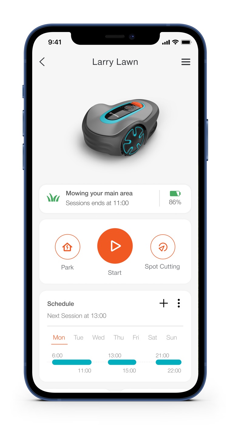
- UX & UI design of the configuration and dashboard experience
- Interaction design of the products' own button-and-LED HMI
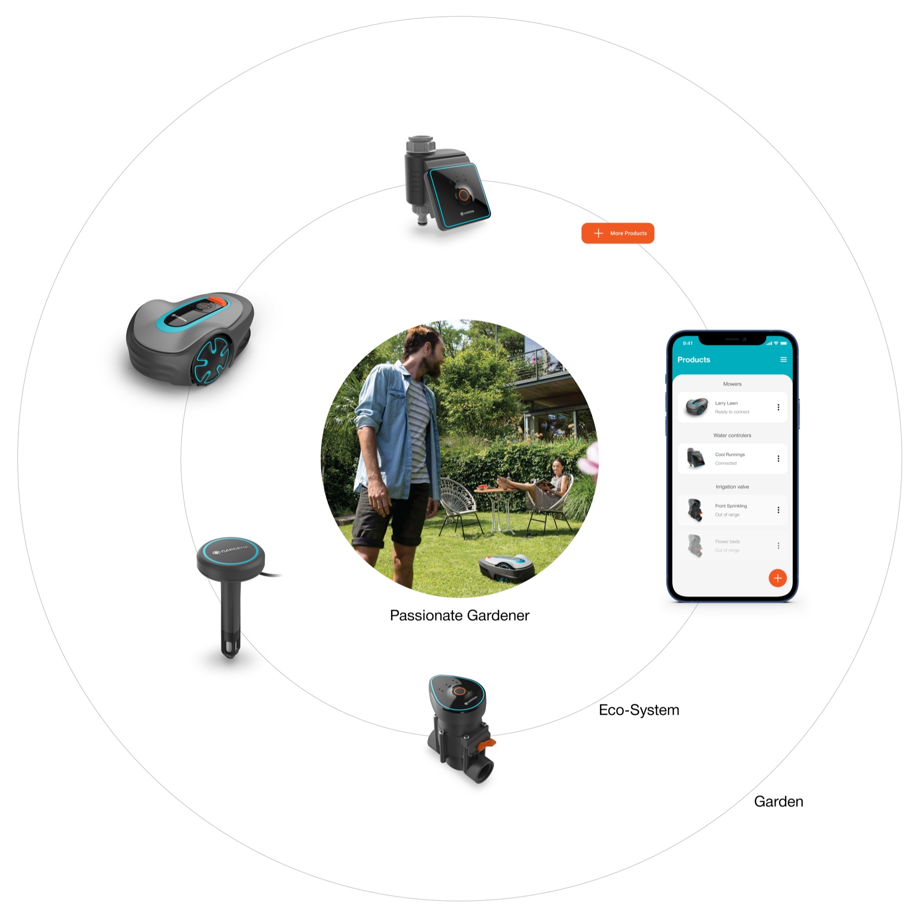
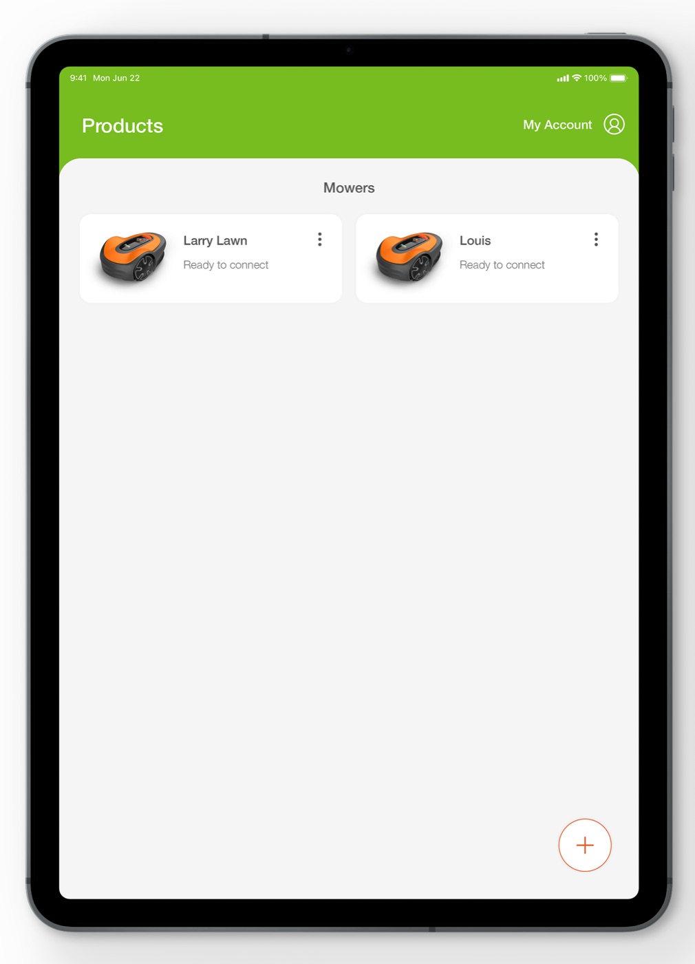
- White-label design system — one foundation shipped as three brands: Gardena, Flymo, McCulloch
Decisions & trade-offs
Three calls that shaped the app
Configuration speed as THE objective
One measurable goal ruled the design: "quickest on the market in the configuration process." Every flow was judged against time-to-configured, not feature richness.
Trade-off — fewer options up front, faster gardens
White-label by architecture, not afterthought
One design system shipped as three brands — Gardena, Flymo, McCulloch — re-skinning colors and product renders while flows and components stay identical. Even the mower's HMI spec carries two brands' button naming side by side.
Trade-off — stricter system discipline, triple the reach
Ship, then test again
Two research rounds bracketed the launch: prototype testing with twelve gardeners before, in-person validation of the live app after — every finding tagged Valuable / Usable / Desirable and turned into the next design agenda.
Trade-off — continuous design budget, compounding quality
Outcome
From hypothesis to the App Store
The app launched natively on iOS and Android on 24 February 2021. In validation testing, every user created an account and logged in within one minute. It's live today, holding a 4.3/5 rating on the App Store across the family, from Sileno robotic mowers to water controllers.
What I learned
When the app is the HMI, UX is product quality
On screenless hardware there is no "the app could be better but the product is great" — the app experience is the product experience. Designing at that seam taught me to treat configuration time as a hardware spec, and a white-label design system as the only way a small team serves a growing family of products across three brands.
Protected deep dive
The full story is behind a password
Client-confidential work — the research, iterations and outcomes are shared with reviewers on request.
Chapter 01
Foundations
A hypothesis, three user goals, and a ladder to measure them on.
Chapter 02
Prototype research
Twelve gardeners and an interactive prototype, seven months before launch.
Chapter 03
The machine’s interface
Five buttons, a handful of LEDs — the HMI designed as part of the same system.
Chapter 04
Ship & validate
Launch was a checkpoint — the shipped app went straight back into research.