Invisible registration — every tested user made it through
The brief
Group-wide product registration redesigned to feel invisible — QR scanning instead of typing, value-first framing instead of marketing. Every tested user made it through in under a minute; shipped January 2021 with its back-office tool.
- Client
- Husqvarna Group
- Timeline
- 2019 — 2021
Launched January 2021 - Role
- UX/UI Designer
- Capabilities
- User research & usability testing
UX & UI design
Service KPI definition
Cross-platform design
The problem
Registration nobody wanted to finish
Product registration across the Husqvarna Group ran on outdated, fire-and-forget web forms — poor UX that took too much time and produced low registration rates and fragmented customer data. The worst moment: manually typing product and serial numbers from hard-to-read labels. The design objective we set: registration with a minimum amount of effort — perceived as invisible.
“We believe that having an incentive and a simple way of product registration will increase the engagement.”
My role
UX/UI through four iterative phases
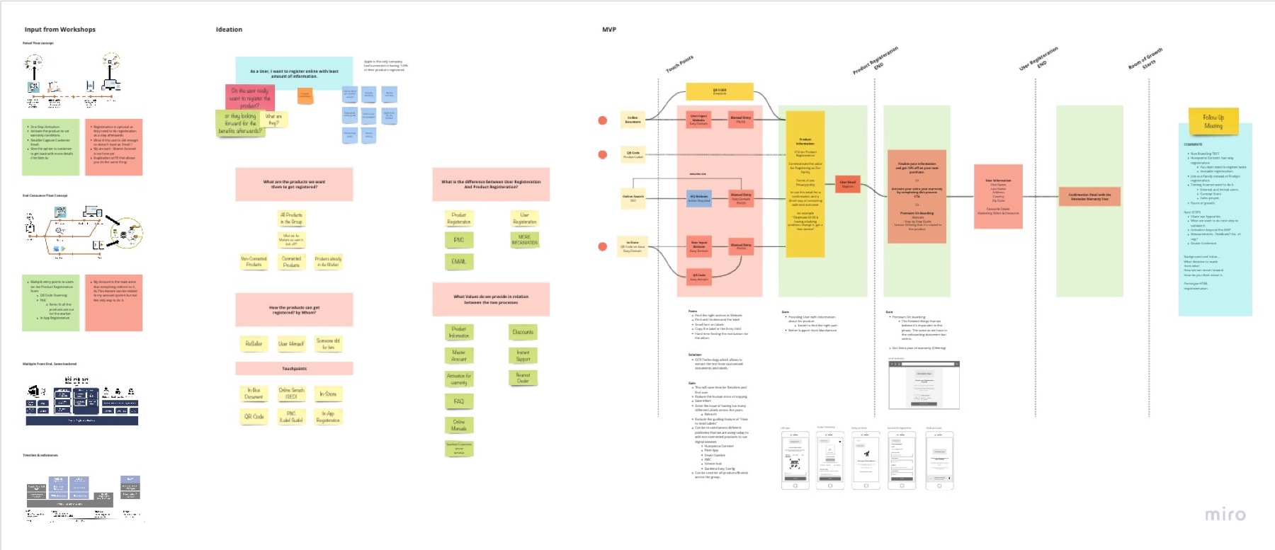
- Research & synthesis — stakeholder workshops, user interviews, concept-store tests
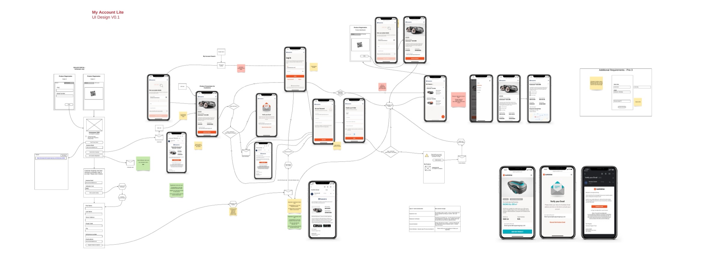
- Flows & prototypes across two documented iterations
- UI design of My Account Lite and the customer-service back office
- Service KPI definition — what "invisible registration" means, measurably
Decisions & trade-offs
Three calls that shaped the product
Kill the "join our family" framing
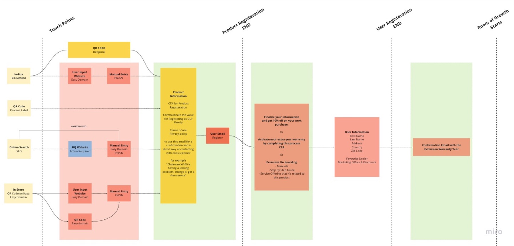
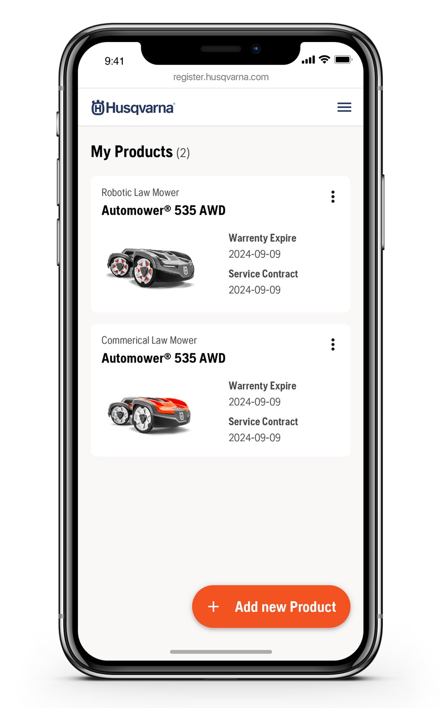
Research showed marketing-first framing made users resist. The reversal: value leads — manuals, warranty, support, dealer info — and membership follows. The product became "My Account Lite", where registration is a side effect of getting something useful.
Trade-off — softer brand moment, dramatically higher willingness
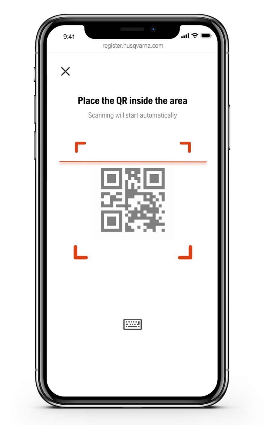
Scan, don't type
The single worst pain was manual serial-number entry from hard-to-read labels. QR and OCR scanning replaced it — faster, fewer errors, and reusable across the group's platforms from Automower Connect to Gardena.
Trade-off — camera-flow complexity, effort score 2.7 vs 3.4
Ship the back office with the front
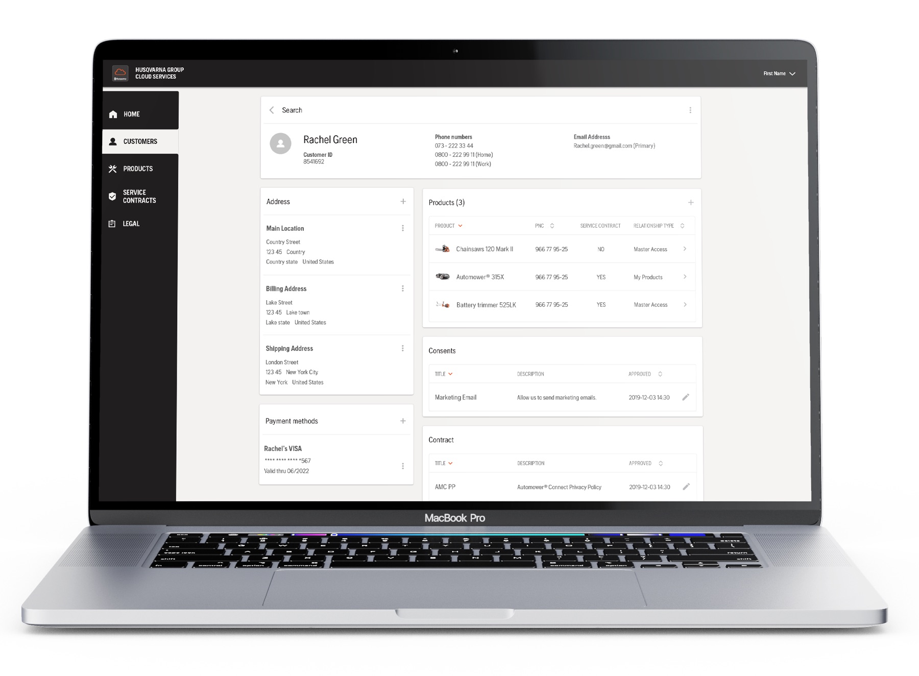
Customer service got its own tool in the same launch — seeing what the customer sees. Registration data is only valuable if the people serving customers can act on it.
Trade-off — bigger launch scope, a complete service
Outcome
Every tested user made it through
In evaluative testing, 100% of participants completed registration, and scanning beat manual entry on perceived effort. The October 2020 concept evaluation with ten users sealed it: account creation rated 1.1 on a 6-point ease scale (1 = very easy, no task worse than 1.9), likelihood to register 4.6 of 6 — verdict: valuable, usable and desirable enough for MVP. Launch KPIs passed: 90%+ completion, first product registered in under a minute. Shipped January 2021.
What I learned
The best registration is the one users don't notice
When a task benefits the company more than the user, the design's job is to invert that — make the value so immediate that the task disappears inside it. "Perceived as invisible" became my bar for every onboarding I've designed since.