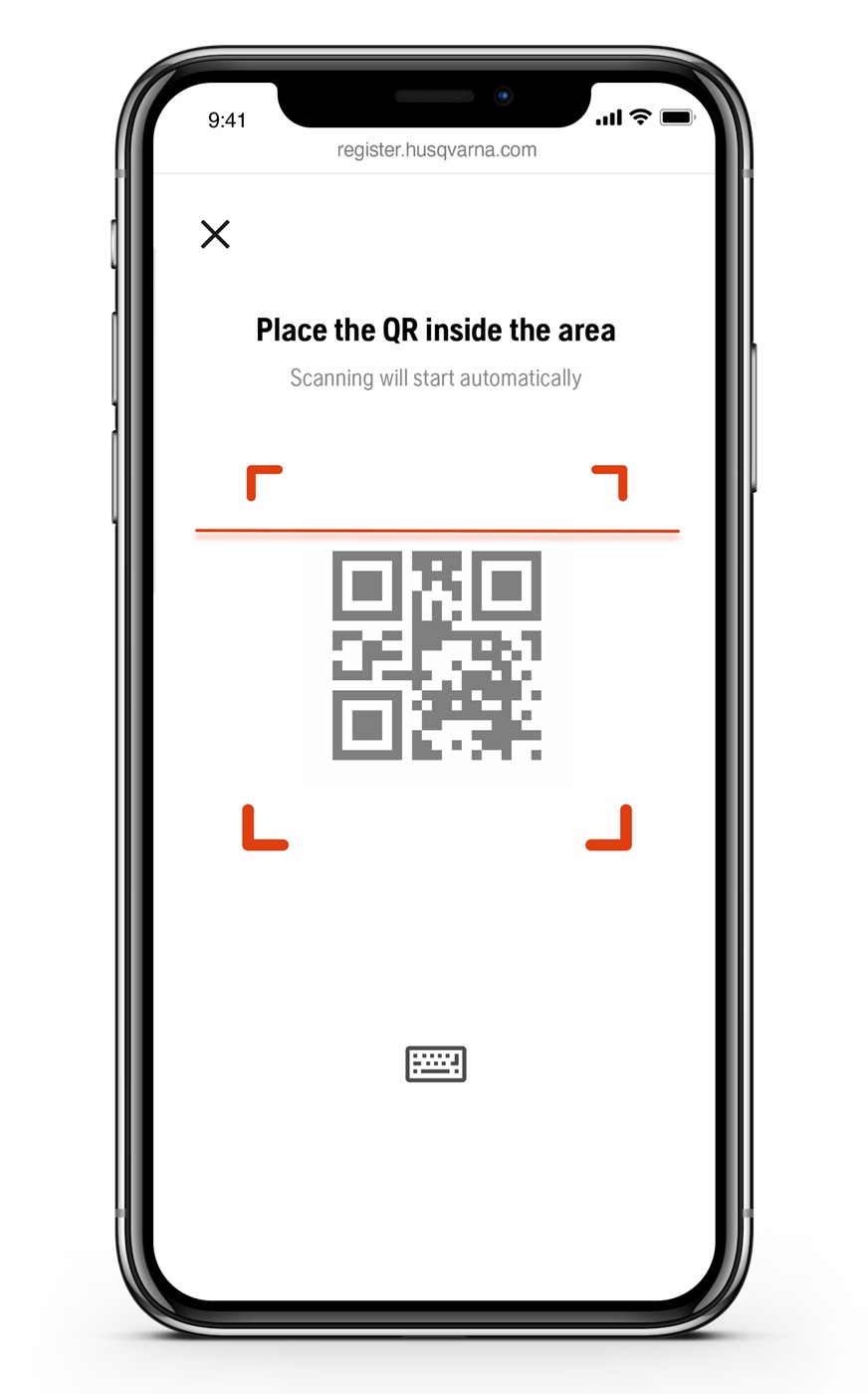
Product registration is a task that benefits the company more than the user — which is exactly why nobody finishes it. Across the Husqvarna Group it ran on fire-and-forget web forms, with a low point every owner recognized: typing a serial number off a hard-to-read label. The design objective we set is the title of this article: registration with a minimum of effort — perceived as invisible.
Invert who the task serves
Research showed the marketing-first framing — "join our family" — made users resist. So the framing flipped: value leads, membership follows. The product became My Account Lite: manuals, warranty, support and dealer info up front, with registration happening as a side effect of getting something useful. The trade was a softer brand moment for a dramatically higher willingness to register.
Delete the worst moment
QR and OCR scanning replaced manual serial entry — the single most painful step in the old journey. Scanning beat typing on measured effort, 2.7 against 3.4, and the camera flow was built once and reused across the group's platforms, from Automower Connect to Gardena. Most flows have one moment users dread; removing it outright is worth more than polishing everything around it.
Make invisibility a KPI
"Invisible" was a number, not a mood. In evaluative testing, 100% of participants completed registration. The concept evaluation rated account creation 1.1 on a 6-point ease scale — no task worse than 1.9 — with likelihood-to-register at 4.6 of 6. The launch KPIs held: 90%+ completion, first product registered in under a minute. It shipped in January 2021, together with a back-office tool that lets customer service see what the customer sees.
The principle travels: when a task serves the company more than the person doing it, the design's job is to invert that — make the value so immediate that the task disappears inside it. "Perceived as invisible" has been my bar for every onboarding since.